Legibility, Readability and Memorability
 Would you rather be remembered or would you rather be understood?
The question is legitimate for written messages and points out the difference between legibility, readability, and memorability. Legibility and readability are different tasks required by typographers. Legibility refers to the quality of the font, the proportions of the characters, consistency of the set as a whole and the font’s own built-in kerning. These characteristics determine a font’s legibility. Sans serif fonts, like Helvetica, tend to be more legible at large sizes. That’s why we see so many signage systems using it.
Readability pertains to the ease of which a given text can be read and is governed by myriad of typographic conventions. Long texts are easier to read if set in serif fonts. Rivers of white caused by justifying text in a narrow column should be avoided. Upper and lowercase letters are easier to read than all caps. Italics and bold should be use for emphasis, not as a body style. These and many more conventions allow the typographer to establish texts that are easily readable.
But are legibility and readability always necessary?
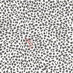
Well, yes and no. If your job is to design an online banking screen that clearly shows a user’s account balance, gives instructions to navigate from screen to screen or allows users to get help easily, then, yes, legibility and readability are your primary concern. But how about a poster for costume ball? Sure, it’s possible to use various weights of Helvetica printed black on white to clearly display the information about the event. That would maximize legibility but is that the best solution to the problem? No. By breaking down the readability, it is possible to achieve a design that is even better—it becomes memorable. If the final design is illegible or if too much readability is lost, the message suffers. Knowing just how much play is appropriate takes good design sense.
I’d hate to live in a world where all design was created for the sake of legibility and readability. Then again, I’d hate to live in a world where those things were not considered.


